How to Choose the Right Colors for Your Neon Lights
When it comes to designing a neon lights, choosing the right colors is essential. The colors you select will not only determine the overall aesthetics of your neon lights but also play a significant role in capturing attention and conveying your desired message. To help you make the perfect color choices for your neon lights, we've put together some tips and considerations that will bring your vision to life.
Reflect Your Brand or Personality:
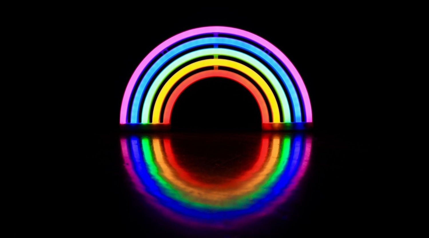
The colors you choose for your neon lights should align with your brand identity or personal style. Consider the emotions and associations different colors evoke. Bright and bold colors like red, yellow, or blue can create a vibrant and energetic atmosphere, while softer pastel shades like pink or mint green can evoke a sense of tranquility or nostalgia. Think about the mood you want to convey and select colors that reflect it.
Contrast for Impact:
Opting for contrasting colors can make your neon lights visually striking and attention-grabbing. Pairing complementary colors, such as blue and orange or purple and yellow, creates a strong contrast that enhances the visibility and impact of your neon lights. Contrast can make the text or design elements pop, ensuring that your sign stands out in any environment.
Consider the Background:
Keep in mind the background against which your neon lights will be displayed. If the background is predominantly dark, bright and light colors will provide a strong contrast and ensure better visibility. On the other hand, if the background is light, darker colors can create an equally compelling contrast. Consider the overall environment and select colors that will make your sign stand out against its backdrop.
Balance and Harmony:
While contrast is important, maintaining a sense of balance and harmony in your color choices is equally crucial. Too many colors or conflicting color combinations can result in a chaotic or overwhelming visual effect. Aim for a balanced color palette that works harmoniously together. Consider using a dominant color for the main message or design element and complement it with one or two supporting colors.
Test in Different Lighting Conditions:
Lighting can significantly impact the appearance of your neon lights. It's important to test your color choices in different lighting conditions to ensure they have the desired effect. What may look vibrant and eye-catching in a well-lit room may appear dull or muted in a dimly lit space. Consider how your neon lights will be illuminated and test the colors accordingly.
Remember, Unrivaled Neon offers a wide range of customizable options for your neon lights. You can visit our website and explore our neon lights or utilize our "Design Your Own" feature to bring your unique vision to life.
In conclusion, choosing the right colors for your neon lights is an exciting and creative process. Reflect your brand or personality, create contrast for impact, consider the background, maintain balance and harmony, and test your colors in different lighting conditions. By following these guidelines, you'll create neon lights that is visually captivating, attention-grabbing, and perfectly aligned with your vision.
Don't forget to visit our website or utilize our "Design Your Own" feature to discover endless possibilities for your neon lights.


